DAY THREE - APPLES AND ORANGES
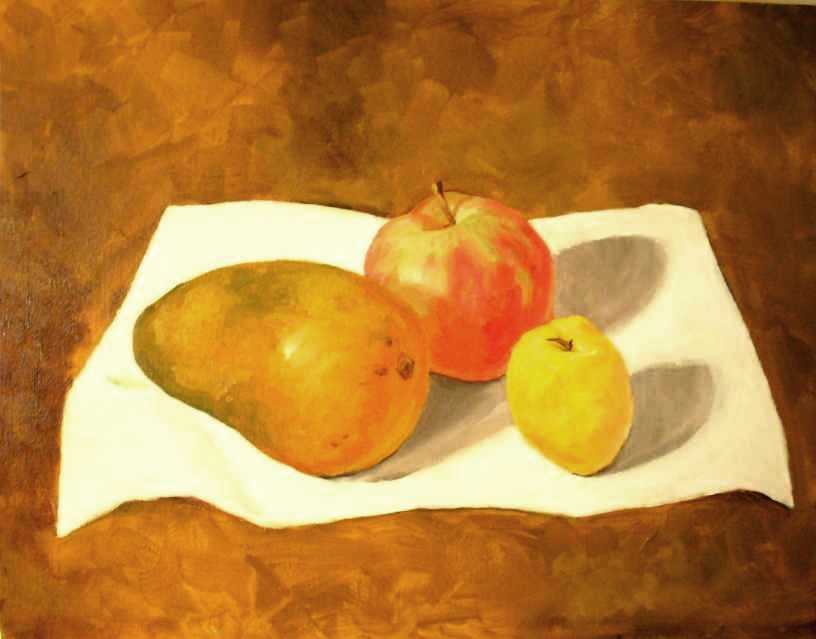
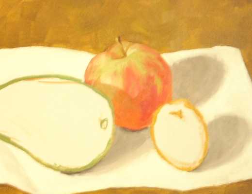
The trick here is to avoid mud. I was surprised how unmuddy it could be. It certainly isn't photo-realism but I'm happy that I got a general appley look. I think it still needs work in the cast shadow of the foreground fruity thing. A key element in making the appearance of a shape (I know this from pencil drawing) is the direction of the strokes but it is being reinforced in this painting.
The reflected light on the underside of the apple is very weak but I'm not seeing reflected light, though I know it should be there.
There are also problems where the back of the apply hits the background. I need a harder edge and more contrast but that would mean changing the whole of the background colour.

The peachy thing doesn't have the gloss shine that the apple does so I made sure to give it no bright highlights. There are some though and even those may be too much. This came together very quickly and I was doing quite a bit of impromptu mixing on the canvas but applying the principles that I'd earlier learned.
The shape is awkward because it looks like it should fall over. It isn't round but almost wants to be lemony and therefore round.
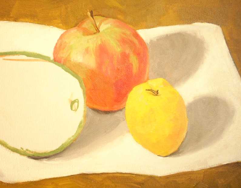
The last big thing. No idea what it is. COmparing it now witht eh photograph, I think the confused shape in the center left may have to do with the highlight being too far to the right. I'll have to see if I can work on that. THis one was mixed, again, almost entirely on canvas.
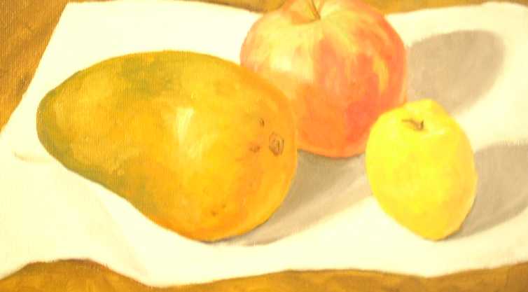
And the big picture. Not finished yet.
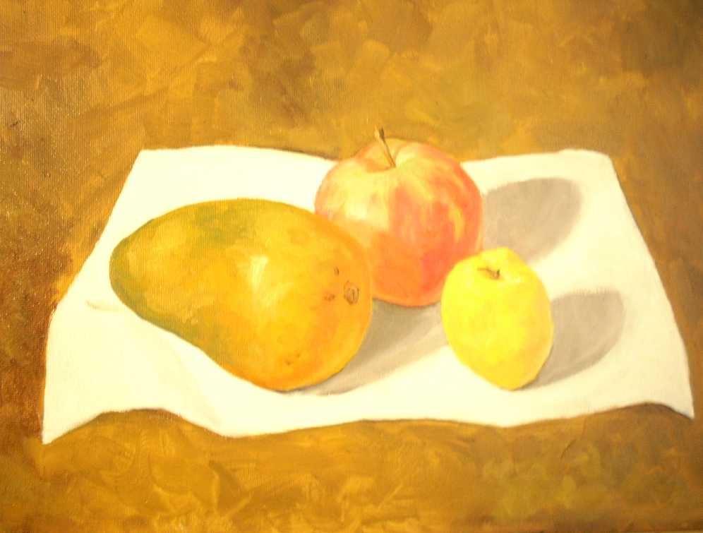
Finished, I think. Maybe I'll use it to experiment with glazes on when it dries. The highlight was moved. It looks much better in person. The photography washes it out.
